Typefaces. The world of movable type may have met its demise as mainstream trade and become an art school speciality or niche hobby. But rather than be smothered by technology, the life of type has only flourished exponentially online.
Cardboard box of metal type for sale
Having grown up with a love of handwriting, I easily expanded the visual feast to include all things type, and now revel in its revival of interest, online or off.
It's easy to take for granted the feel and philosophy conveyed by a well-designed typeface. I recently came across this excellent video that effectively tells the story of one familiar font.
From its Birth in Europe to the Moon and Back
Futura and Transportation
Futura was created between 1924 and 1928 and effectively captured the age of increasing speed and innovation in transportation.

An American metal type specimen sheet of Futura Oblique. Design shows a hypothetical layout advertising a car. Date presumably late 1920s-1930s. Photo: James Puckett

Knights of the Skies, a children's 1935 tale by Polish author, Zofia Dromlewiczowa
The Moon Plaques
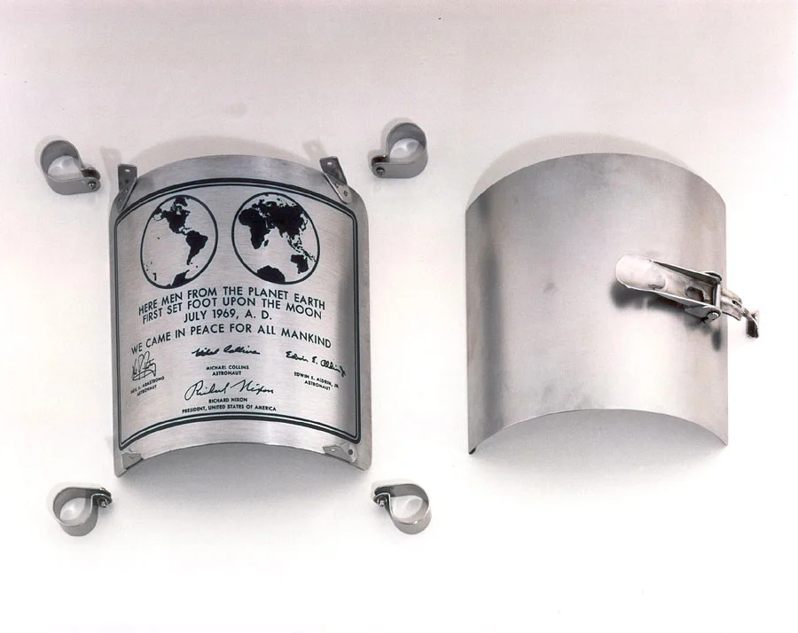
The 9 x 7-5⁄8" stainless steel plaque that was attached to the leg of the lunar landing ladder, Apollo 11

Apollo 11 ladder closeup while on the moon
The Footnotes of History
Presidential speechwriter William Safire wrote the copy for the first plaque, along with a little known speech for Nixon to read in case of the disaster of stranded astronauts. This worst-case senario speech was revealed only in 1999. Safire writes of his involvement with the plaque and speech in this fascinating New York Times article, 20 years after the landing. He wryly notes that AD should have been placed before the year, not after: "I had a hand in the first sign to be placed by earthlings on another celestial body, and it contains a glaring grammatical error."
The final plaque, Apollo 17's, left on the moon
Meanwhile the plaque, with its futuristic Futura font, along with one from each of the subsequent moon missions, was left on the moon. Six plaques are there from Apollo missions 11, 12, 14, 15, 16 and 17, each curved to fit around the leg of the ladder on the landing module and placed there during descent. Each bore the signature of the astronauts on the mission: the aborted Apollo 13 mission had two plaques made since one of the astronauts was replaced in the final days of preparation. The replacement plaque came safely back to earth and is still in the possession of astronaut James Lovell. The initial, incorrect plaque for the mission was still attached to the landing module during the dramatic return to earth and burned up on reentry.
Such is the life of a moon mission plaque. The essence of the mission was captured not only in text, but also in the font. The craft of the writer and designer was also a part of the moon mission.
“The essence of the mission was captured not only in text, but also in the font. The craft of the writer and designer was also a part of the moon mission.”
Thanks to Jeremiah Wolf of Typewolf: What's Trending in Type for the video recommendation. Header image: Brandenads, from work created by Willi Heidelbach